The boring way to read the drug pipeline beat the clever one
Two percent of the drug pipeline carries roughly 40% of its cost-weighted exposure. I went looking for that risk with three signals, one pointed the wrong way, one could not rank what mattered, and the one that worked barely needed a model.
Health plans and pharmacy benefit managers spend real effort tracking what is coming out of the drug pipeline. The standard artifact is a horizon list: here are the programs approaching a regulatory decision, here is roughly when. I wanted to build a better one, weighting each program by how likely it is to launch and how expensive it would be, so a plan could reserve against expected cost instead of a raw roster.
I had three ingredients: program counts, an approval-probability model, and modality cost tiers. Working through an exploratory dataset of about 232 upcoming programs assembled entirely from public sources, the three delivered very differently.
Count misled first, this one I expected
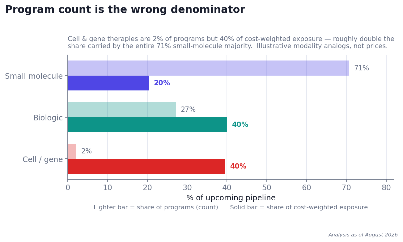
Small molecules make up 71% of the programs but only about a fifth of the cost-weighted exposure. Cell and gene therapies are 2% of the count and roughly 40% of the weight, double the share carried by the entire small-molecule majority. Program count is the wrong denominator: anyone planning by how many drugs are coming is anchored on the least expensive tier. That is not surprising once you see it. What is surprising is how often the horizon list is still sorted by count.
The probability model could not rank it, this one I did not expect
The whole point of weighting was that most pipeline programs do not launch, so a good probability estimate should reorder an inflated roster. It did not. The probabilities came out bunched high, a median around 0.77, almost everything between 0.6 and 0.8, and the order of who to worry about barely moved.
To be precise about the failure, because the distinction matters: the model did do something. It shaved the roster from 232 programs to about 170, a 27% deflation of the overall level, which is real if you are sizing a single number. What it could not do was change the ranking. I hired it to reorder exposure; it could only scale it.
My first instinct was that the model was miscalibrated. It probably is not. Programs that reach a horizon list are mostly late-stage, and late-stage drugs genuinely approve at high, tightly clustered rates, and a compressed distribution is the honest one. The problem is not the estimate. It is the axis.
Here is the asymmetry that decides it, and it is not an artifact of my labels. Among drugs that have actually launched, a one-time cell or gene therapy lists in the low millions while a common small molecule runs in the low thousands a year, so in the year a program lands, the exposure it can add to a plan spans well past 60x. Approval probability, bounded between zero and one and clustered near the top for late-stage assets, spans about 1.3x. When one axis varies sixty-fold and the other by a third, the second cannot reorder your exposure no matter how well you model it.
When cost varies by more than 60x and approval probability by about 1.3x, no amount of modeling the probability will reorder your risk.
Two honest exceptions keep this from being a blanket dismissal. The first is scope: horizon lists pre-select for late-stage programs, which is exactly why probability was inert here. Point the same method at an earlier-stage pipeline, where approval odds really do range from 5% to 60%, and probability would carry real weight; the lesson is to check whether your candidates differ on a variable before you model it, not to ignore probability. The second is the tail: when a single program is a double-digit slice of your exposure, the gap between a 0.6 and a 0.8 chance of approval swings the variance around your reserve, even if it never changes the ranking. For the tail, model the probability. For the ranking, do not bother.
What survived was almost embarrassingly simple
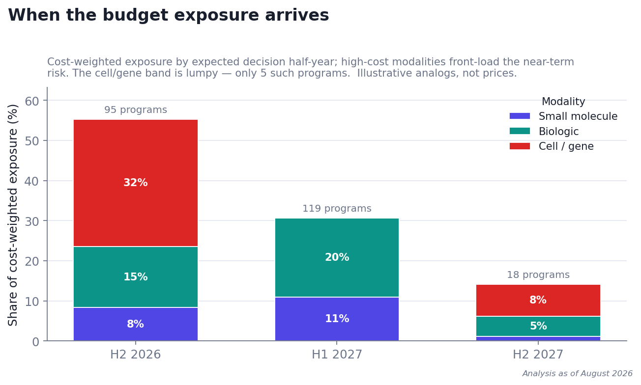
Rank by modality cost tier. That is the whole ranking. Then read it against the calendar, not to change the order, but to see when the exposure lands. In this dataset the nearest half-year carried more than half the cost-weighted exposure, front-loaded by a handful of high-cost programs, even though a later window actually contained more programs.
One qualifier belongs here, not buried in a footnote: modality tells you the price per patient, not how many patients you will have. A multi-million-dollar therapy for a one-in-100,000 condition can carry less real per-member cost than a biologic for a common one. Cost tier is the right first cut, the triage lens that tells you where to look, but turning it into a per-member-per-month number means multiplying by prevalence and expected uptake. That is the next layer, and it is where a plan’s own data comes in.
Why I am writing this down
Two caveats close the loop. The cost tiers are stand-ins, deliberately rough bands by modality, not drug-specific prices, which are unknowable before launch and would come from licensed data. And the dataset is a snapshot: exploratory, directional, and already aging as decision dates slip, so a horizon like this earns its keep only if it is re-run.
But the lesson survives both. Before you reach for a model, find out which axis carries the variance. When a cheap variable explains most of it, bolting a model on top can cost you credibility instead of buying it. The boring denominator won.
Data & disclosure. Exploratory analysis on public data: ClinicalTrials.gov, SEC EDGAR and FDA calendars, Open Targets and STRING (CC BY), ChEMBL (CC BY-SA), gnomAD, DepMap, GTEx, RxNorm, and UniProt. Figures use illustrative modality cost analogs, not drug-specific prices. Nothing here is medical, actuarial, or investment advice, and no specific drugs or companies are named.