Two Atlanta offices, 8 miles apart, $1,466/EE in projected chronic disease cost
What ten chronic conditions already explain about your renewal, before you even open the claims file.
If you run a workforce chronic-disease cost projection for an Atlanta employer using state-level Georgia benchmarks, you get a number. It’s defensible. It’s the number your wellness vendor and your broker probably both use.
And it’s almost certainly wrong for the actual census in front of you.
Here’s a concrete example, run through EPHP. Two hypothetical Atlanta employers, both 5,000 employees, default age mix, identical sex distribution:
- Employer A: office in Buckhead (ZIP 30327)
- Employer B: office in the West End / southwest Atlanta (ZIP 30310)
Driving distance: about 8 miles. Projected annual cost attributable to the ten major chronic conditions:
| Buckhead (30327) | West End (30310) | Delta | |
|---|---|---|---|
| Chronic-disease cost / EE | $4,853 | $6,319 | $1,466 |
| Total (5,000 EE) | $24.3M | $31.6M | $7.3M |
| vs. US benchmark | -16.7% | +8.5% | 25 pts |
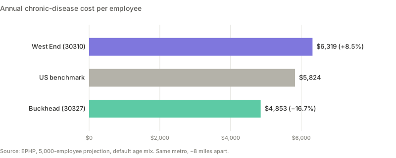
Two workforces, eight miles apart in the same metro, sit on opposite sides of the US average for chronic disease cost. State averages don’t just smooth the variance, they hide it entirely. National averages don’t help either, because they fall right between these two.
To be clear about what this number is and isn’t: this is the cost attributable to ten major chronic conditions in CDC PLACES, not total cost of care. Pharmacy beyond these conditions, behavioral health beyond depression, maternity, high-cost claimants, MSK and injury, network effects, and utilization patterns simply aren’t in EPHP’s scope. The true total-cost gap between these two workforces is almost certainly larger than $1,466/EE. Some of those missing categories can be modeled by extending the same public-data methodology (maternity rates, behavioral health access, SDOH overlays, GLP-1 exposure). Others require your own claims tape (TCOC calibration, network effects, claims-tuned cost coefficients). Either is in scope for custom analytics. More on that below.
A $7.3M annual gap on chronic conditions alone is many multiples of what an aggressive wellness program would cost on a 5,000-person workforce.
Where the gap comes from (and where it doesn’t)
This is the part most readers won’t expect. Buckhead is not uniformly “healthier.” The cost gap is concentrated in a specific subset of conditions, and the composition tells a more honest story than the headline.
| Condition | Buckhead (30327) | West End (30310) | Ratio |
|---|---|---|---|
| Big divergence (the cost drivers) | |||
| Stroke | 2.3% | 5.5% | 2.4x |
| COPD | 3.6% | 8.1% | 2.3x |
| Diabetes | 8.3% | 17.9% | 2.2x |
| Hypertension | 30.4% | 44.9% | 1.5x |
| Roughly equal | |||
| Depression | 17.1% | 17.5% | 1.0x |
| High Cholesterol | 36.7% | 35.0% | 0.95x |
| Reverse divergence | |||
| Cancer (excl. skin) | 9.6% | 5.0% | 0.5x |
Three different patterns inside one cost number.
The four conditions at the top are the ones most strongly associated with SDOH factors: food access, smoking exposure, chronic stress, housing stability, and care continuity. They diverge sharply. Depression and high cholesterol are roughly equal across both ZIPs. And cancer prevalence is actually higher in Buckhead, almost certainly a longevity-and-screening artifact (people who live longer and screen more get diagnosed more).
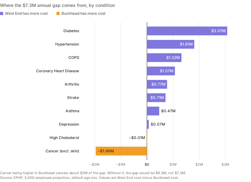
If cancer were equal across both ZIPs, the gap wouldn’t be $7.3M, it would be closer to $9.3M. The cost story isn’t just about which conditions are higher. It’s about which ones offset which.
The narrative “the wealthier ZIP is healthier” is too coarse. The accurate story is: Buckhead has dramatically fewer of the chronic conditions most mediated by environment, similar rates of conditions less tied to environment, and more of the conditions that scale with longevity and screening. The same total cost number, if you don’t decompose it, hides three completely different drivers.
This matters because the addressable savings opportunity is structurally different in each ZIP. EPHP’s evidence-tiered estimates:
| Buckhead (30327) | West End (30310) | |
|---|---|---|
| Care-management addressable (total) | $0.9M to $1.6M | $1.4M to $2.5M |
| Per employee | $177 to $322 | $288 to $491 |
The high-burden workforce isn’t just more expensive. It also has more headroom for a well-designed care-management program to actually move the number. Same vendor, same program, structurally different ROI.
Why averages mislead
Georgia’s statewide diabetes prevalence sits around 12%. The US average is similar. Both numbers are roughly the midpoint of the two ZIPs above, which means they’re wrong for both, in opposite directions.
Averages systematically:
- Overprice low-burden workforces. You lose underwriting bids you should win.
- Underprice high-burden workforces. You walk into surprise renewals.
- Hide the variance entirely. Broker and employer can’t have an honest conversation about where the cost is actually coming from.
Everyone knows ZIPs differ. The analytical point is how much they differ in dollar terms once you apply real cost coefficients. And how aggressively that variance washes out the moment you aggregate to county, MSA, or state.
What this changes in practice
Renewal conversations. A workforce concentrated in high-prevalence ZIPs has a structurally higher chronic-disease burden than the carrier’s book average implies. Chronic disease is the upstream driver behind a meaningful share of total claims. Walk in with that directional signal modeled, not after the loss ratio shows up.
Wellness vendor evaluation. Addressable savings scale with baseline prevalence. On the same care-management program, the West End workforce has roughly 1.5x the per-employee headroom of the Buckhead workforce. If the vendor is quoting the same ROI to both, one of those quotes is wrong, and the diligence question is which one.
M&A and remote-work decisions. Acquiring a company with a different geographic footprint (or letting your workforce distribute across the Sun Belt) is also a health-cost decision. It usually isn’t priced as one.
Methodology
- Scope: cost attributable to the ten major chronic conditions in CDC PLACES, not total cost of care
- Prevalence: CDC PLACES 2024 release, census-tract estimates aggregated to ZCTA
- Cost coefficients: MEPS Household Component 2021-2023 pooled, age-stratified
- Demographic adjustment: age-band weighting (default US mix used here for like-for-like comparison)
- No PHI required: projections run on ZIP + headcount only
The “geographic variation range” in each EPHP report is a directional read on within-workforce dispersion, not a statistical confidence interval. A true interval would require Monte Carlo over MEPS coefficient errors, PLACES small-area model error, and trend uncertainty, and would be materially wider. EPHP discloses this transparently on every report.
You can reproduce both projections yourself in about 90 seconds on ephp.dev.
The next question
EPHP answers “what should this workforce cost on the chronic-disease prevalence baseline?” It doesn’t answer:
- What’s the actual total cost of care? Medical + Rx + behavioral, normalized PMPM, calibrated against your own claims and benefit design. The same Buckhead-vs-West End comparison, but on a true TCOC basis.
- What’s the SDOH overlay behind the stroke-diabetes-COPD divergence? Food access, transportation, housing stability, broadband, and ADI all map to this gap, and each opens a different targeted intervention.
- Are we even modeling the right ZIPs? The HQ ZIP is a work address, not a residence. Workers commute in from a distribution of home ZIPs, and residence is what actually drives the prevalence and cost baseline. Public commuting-flow data lets you infer that residence distribution from an HQ ZIP and weight the model accordingly.
Every one of these is in scope for custom analytics. EPHP is the free tip of that iceberg.