They moved south. Did costs go up?
A workforce's health-cost risk changes the day its footprint changes. The direction is rarely the one you'd guess, and you can model it from ZIPs and headcount, long before any claims arrive.
A mid-market services firm (we’ll call it Meridian, and the numbers below are illustrative) closes an acquisition. The target is a 1,100-person company spread across Dallas, Houston, Atlanta, and Phoenix. Meridian folds it in, consolidates onto one plan, and quietly shutters its small Hartford office in the same quarter. Headcount jumps 38%, from 2,400 to 3,300.
The CFO asks the obvious question: what does this do to our health spend? And the obvious answer comes back just as fast. More people, Sunbelt geography, higher chronic-disease burden, so costs go up, probably more than proportionally.
That answer is half right and half completely wrong. And the half that’s wrong is the half that drives the decision.
The question nobody models until it’s too late
Claims data lags real events by a year or more, and at the moment of a decision it reflects the old population, not the one you’re about to have. Carriers reprice reactively at the next renewal. And in an acquisition, the target’s claims data doesn’t exist to the buyer at all before close. Diligence happens in exactly the window where the one dataset everyone relies on is unavailable.
So the risk moves the moment headcount moves, but the evidence that proves it shows up 12 to 18 months late, priced into a renewal nobody saw coming.
There is one thing that works in that window, because it needs no protected health information at all: a model built from where people live and how many of them there are. Public, census-tract prevalence data plus per-condition cost coefficients, anchored to ZIP codes and headcount. It won’t give you a member’s claim. It will give you the expected chronic-disease cost of a population (current, proposed, or hypothetical) and, more importantly, the difference between two of them. That difference is the whole game.
A worked example: Meridian’s footprint, before and after
Start with the map. Each bubble is a metro; its size is headcount and its color is the expected chronic-disease cost per employee for that ZIP. The left panel is Meridian today. The right panel adds the four acquired Sunbelt sites and strikes out the closed Hartford office.
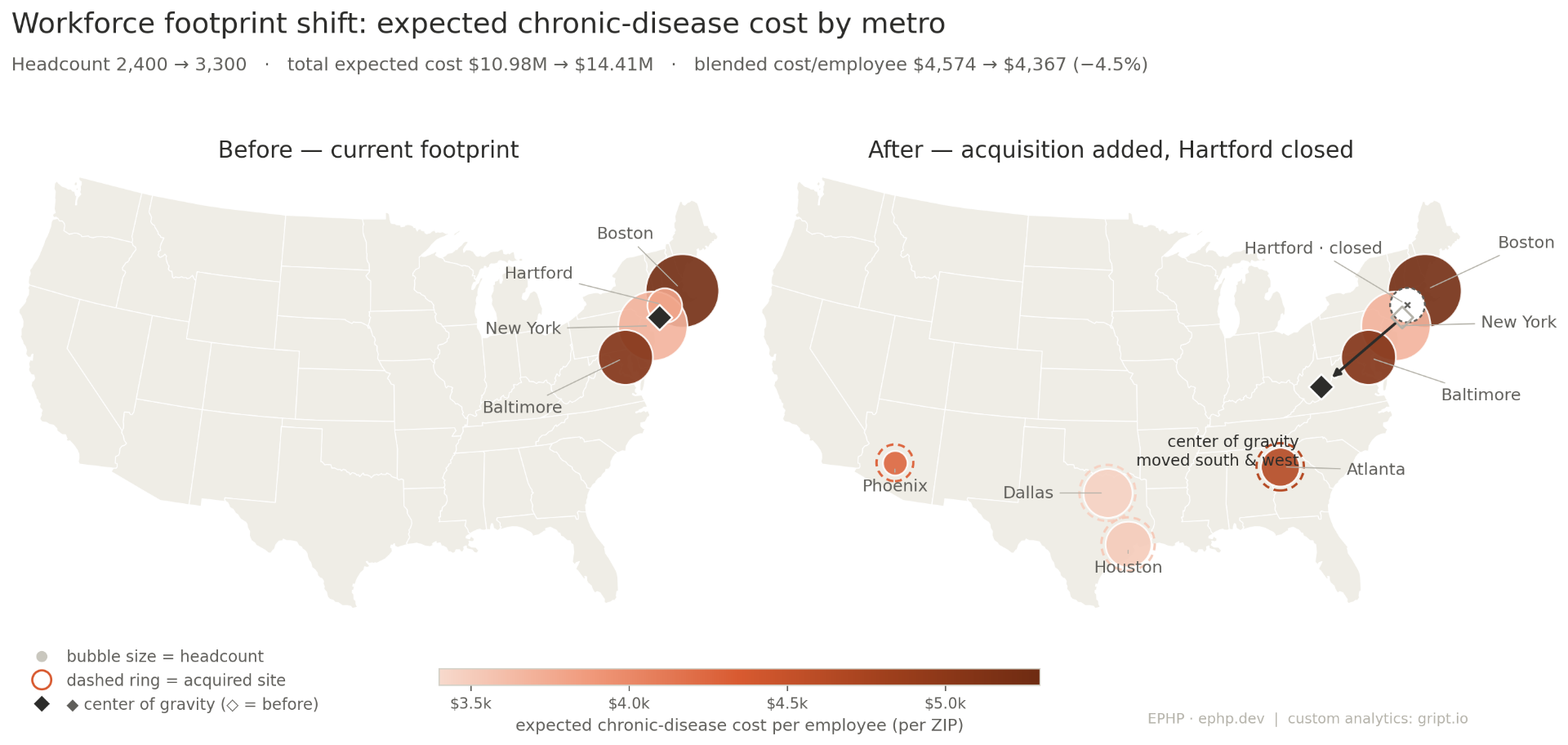
The center of gravity moves a long way, decisively south and west. That part matches the intuition: the workforce really did shift toward the Sunbelt. If you stopped at the map, you’d nod along with the CFO’s guess.
But look at the colors, not just the positions. The new bubbles are lighter than the Northeast ones they’re joining. The center of gravity moved toward cheaper geography, not costlier.
Now put a number on it
A map shows that the footprint changed. A bridge shows what it costs. This is the same chart a deal team already reads for EBITDA: a baseline, the contribution of each change, and a new total.
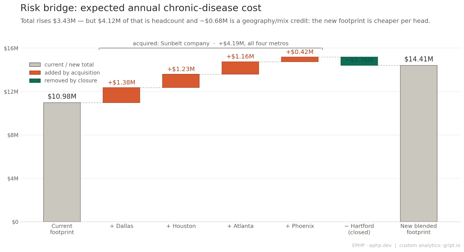
Expected chronic-disease cost rises from $10.98M to $14.41M, up $3.43M. So the CFO was right that costs go up. But decompose that $3.43M and the story inverts:
- +$4.12M is pure headcount: the net 900 new employees, valued at the old blended rate.
- -$0.68M is a geography-and-mix credit, because the population you added is cheaper per head than the population you had.
On a per-employee basis, Meridian’s blended expected cost doesn’t rise at all. It falls 4.5%, from $4,574 to $4,367. The acquired Dallas and Houston ZIPs ($3,457 and $3,507 per employee) are the two least expensive in the entire footprint; the Boston and Baltimore ZIPs it’s diluting ($5,244 and $5,101) are the two most expensive. Closing Hartford removed a cheap site, which nudges the blend back up slightly, and the model captures even that.
Why the obvious answer was wrong
The intuition that “moved south, so more burden, so costlier” fails here for a specific, instructive reason: it reasons about region when the cost is set by tract. “The Sunbelt” isn’t a number. A downtown Dallas ZIP and a rural Mississippi ZIP are both “the South” and are nothing alike. The only way to know which direction a real footprint moves the blended cost is to run the actual ZIPs and the actual headcounts. You cannot read it off a compass heading.
This is also why mix matters more than magnitude. A change can leave the total nearly flat while quietly shifting the composition of cost: more behavioral health, less musculoskeletal; more cardiometabolic, less respiratory. A flat-total move can still demand a different vendor stack, a different stop-loss posture, and a different plan design. The number you book is only the headline; the mix underneath it is what you actually manage.
When this comes up
Three moments change a workforce’s geographic and condition footprint, and all three are routinely under-modeled.
- Opening or relocating a site. You’ve picked the metro; the question is what the new ZIPs do to the blend, and which existing sites they shift the center of gravity toward.
- A return-to-office or remote-work shift. Moving a few hundred heads between hubs, or letting them disperse, re-weights the footprint without any hiring at all.
- M&A and PE roll-ups. This is the strongest fit, because health cost is a real margin lever and the modeling needs zero PHI. Before close, you can score a target’s workforce health liability straight from its locations and headcount, exactly when its claims are off-limits. After close, you can model the blended risk of consolidating multiple portfolio companies onto one plan or captive. A roll-up that looks like four similar businesses can carry four very different health-cost profiles, and the blend is rarely the average you’d assume.
How it’s calculated, and what it is not
The estimate is deliberately transparent and reproducible. Prevalence comes from CDC PLACES (census-tract level); per-condition cost coefficients come from MEPS; ZIPs map to tracts via the HUD/Census crosswalk. No claims, no PHI, no black box. Your actuary can reproduce it.
Two honest limits matter, especially given the result above.
- This is chronic-disease cost, not total cost of care. The model covers the ten high-prevalence conditions that employer programs target. It deliberately excludes acute and emergency care, maternity, behavioral health beyond depression, musculoskeletal and injury, most pharmacy, and catastrophic claims. It’s a directional proxy for the spend you can act on, not the whole premium.
- The geography signal is clean; the demographic signal needs a second layer. The example above holds the age mix at its default. In a real acquisition the age curve usually shifts too, and age moves chronic-disease cost at least as hard as geography does. So Meridian’s 4.5% per-head credit is real for the populations as modeled, but a workforce-age overlay could narrow it, erase it, or flip it. That’s not a flaw in the method; it’s the next variable to add.
In other words: the free, public-data model nails the question “which direction does our geography push cost, and by how much?”, the question almost nobody answers before the claims arrive. The questions that follow it are where the model gets sharper.
From directional to decision-grade
If you want to take the same delta framework from a directional read to a number you’d put in a deal model or a renewal negotiation, that’s the custom layer. It extends this exact bridge to total cost of care (medical, Rx, and behavioral, normalized to PMPM and aligned to your actuarial basis) and adds the workforce-age overlay, claims calibration on either side of a deal, and stop-loss tail modeling for the catastrophic-claim risk a per-head average can’t see.
The free tool tells you the direction and rough magnitude of the chronic-disease shift. The custom build tells you the full PMPM delta you’ll actually book.